Dear lord, the Amazon. And the Sorceress, but for completely different reasons.
Japan sure loves their D&D 2e. And their titties.
Dear lord, the Amazon. And the Sorceress, but for completely different reasons.
Japan sure loves their D&D 2e. And their titties.
Because, look at them! Even if you look at Vanillaware’s other concept art this is crazy.
http://storage.siliconera.com/wordpress/wp-content/uploads/2011/06/dragons_crown_amazon_01.jpg
I’ve heard complaints about characters heads being smaller than their breasts but her’s is smaller than her shoulder muscles.
http://storage.siliconera.com/wordpress/wp-content/uploads/2011/06/dragons_crown_sorcerer_01.jpg
The Sorceress has managed to twist herself into a position where she’s sticking her butt at the screen, yet we can still see both breasts, and her arm is in such a position that her staff is nestled in her butt crack.
The in-game artwork looks fine but these two pieces of concept have some major compositional issues.
I <3 Sorceress
Shadows over Mysteria - Weaboo edition FTW
dude it’s just his style, who gives a shit. It’s one thing to complain about the sexualization I suppose, but his style is just his style. He has never once tried to do art realistically. Just look at the side characters like Odin or that other dude, or Raijin in Muramasa. Kamitani just likes to massively exaggerate perspectives and such.
No way is it close to Rob Liefield bad, I think for the Amazon it was a perspective shot, for the appearance of her looking very tall, but it was slightly off so I do agree her head should’ve been much larger.
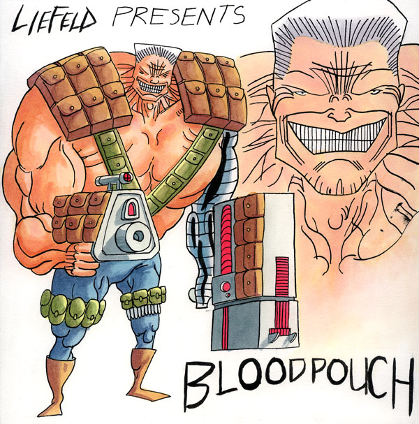
To Liefield’s credit he draws some damn good faces, even though the head and the rest of the body in general is with terrible proportions, allll the time. I was mad, when I would see he was the artist for Deadpool Corps with each issue, then the guest spots shit over him lol.
GTFO of this thread and don’t come back until you’ve played them both until your eyes bleed.
Go ahead, son… chop chop! clap clap
Someone has to say it.
I’d smash Amazon over Chun.
I looked at some of the other artwork from the links you gave. It’s very exaggerated proportions in general, which is stylized. The way the artist draws perspective though, warps their proportions even more, and that’s where it falls apart. I’d say it’s less emphasis on composition issue, and more on perspectives and view points that screw with the proportions even more, making the composition look worse. The artist’s proportions are already very stylized.


Again, I still wouldn’t go as far as to say they’re almost as bad as Liefield’s, cause I have a hard time even seeing perspective in Liefield’s drawings, they tend to lay flat, and have inconsistent proportions from frame to frame, with no change in perspective. This guy’s stuff has one aspect making another look even worse than should. I’m not defending the work, moreso just saying it’s not almost as bad as Liefield lol.
Liefeld’s art is bad because he CAN’T draw proportions.
This artwork is fine because it is intended.
I have made it abundantly clear that I am familiar with the style. I even posted links to the concept art for previous games. The quality of the composition of these two pieces seems to be jarringly different.
Even Raijin’s head makes more sense compared to the body size than Amazon’s

I think the game looks cool. All of Vanillaware’s games look cool. I only have issue with these pieces of concept art and that’s only because this issue with them seem to go beyond the umbrella of “style.” If these were done by Hyung-Tae Kim http://www.creativeuncut.com/gallery-10/mc2-zephie.html it wouldn’t be so surprising.
Edit: Though I guess it is harsh to compare anyone to Liefield. I mean he’s kinda in a league of his own.
Whaaaa? All of Liefield’s characters’ faces look like they are in varying degrees of constipation.
Every Liefeld face ever.
Constipated and lacking an upper lip.

Also, the ULTIMATE LIEFELD CHARACTER AND NAME.

Female faces.
But yeah, I tried to at least give Liefield a tad bit of credit, my bad, I shouldn’t have done that. Cause, yeah… man. Ugh.
Even Deadpool makes fun of his co-creator’s art work, joking his excessive pouches lol
Dragon’s Crown = fastest growth of hentai pics EVAR
This morning had 2 pages already on japanese art websites, now in the early afternoon there are 3 pages.
Game is getting bought on the first day. I played Muramasa but I have yet to play odin sphere.
Is this getting a retail release or is it a PSN download? Either way im copping this.
Sorceress…
Dem Chesticles are outta control! This is bought Day 1. Love Vanillaware.
This game looks amazing, I can’t wait for it.
game looks dope. i really hated odins sphere, what a shit game. this on the other had looks like it actually might be fun to play and looks good at the same time. dope. with hard corps uprising already available, and rayman coming out it looks like old school games are finally getting the love thst they needed.
i couldnt stand the ps1 rayman games or the later ones. this new one looks lreally great though, might be fun too.
Fuck off, Shadow Over Mystara. I got a new bitch now…