yeah poll would definitely clear this whole thing up.
Crazy Blanka dfist.
Star good action sense man. Just finish it up.
yeah poll would definitely clear this whole thing up.
Crazy Blanka dfist.
Star good action sense man. Just finish it up.
Karin;
http://img.photobucket.com/albums/v416/Hanzou8287/Karinsmall.jpg
I may do one last one, just for the hell of it, but I dunno.
Long time no see man. I really dig the CFJ-style coloration.
I’m a bit torn on which to submit but I guess it would be these two, seeing that there’s not that many Karins yet.
and this one:
It’s supposed to be the infamous stand fierce but the legs and hands turned out silly. But I suppose I won’t learn unless I practice.
Another one, and then I’ll cut down on the fanservice and the Karin obsession and go back to practicing the male figure XB
“It was July and the Kanzuki mansion’s airconditioning broke down.”
Sup dudes, hehe, lotsa buzz about the next game. I’ll put up a poll soon to keep an official vote.
Here’s my Karin:
http://ronssketchpad.combovideos.com/csfac/karin/images/ron_chan.jpg
as i said on dA, he looks like proud matador. very fitting
i love your karin chainwhore…
in the mood for one more karin
I definitely think Darkstalkers should be our next game we do.
This time I’ll stay all the way through. 
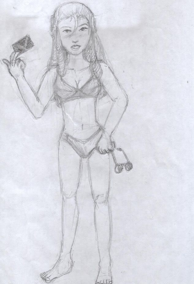
Karin is my favorite character and I’ve been waiting so long to see what you would do, and its great… except one thing. Her right hand seems to be a little off, it looks like its in an unnatural position. Or is that a common way to hold your hand in certain types of martial arts?
hey i just realize samurai showdown series would be great for the next challenge…other than that its Darkstalkers all the way…
here’s vega.
http://img66.imageshack.us/img66/8568/vega9zs.jpg
used a3 art pose as ref, something I don’t really like doing but I really dig the pose.
nice karin, CW. really sweet man. The left leg rendering is [/shao kahn] impressive[shao kahn]
Whoops! DFist, and whoever else just voted first on the voting thread, you’ll have to vote again. I deleted the thread I made and made a new one because I screwed up the close date on the poll.
I say the next game we do should be WCW/NWO Revenge,
I’ll have a pick of Glacier up tomorrow.
Alright, I found some time to sit down and catch up on some critiques. J
Vslash: Cool idea for a pic on the Vega, but its so light I can barely make it out on my crappy laptop screen! My main crit from what I can see, is that the positions that they are standing at seem a bit odd for the story. Since Vega is supposed to have slapped Cammys ass, it would make more sense if he were behind her rather than have them facing each other. Very fun Mika pic, and pretty good exaggerated anatomy too. I think overall, the structure is just a tad wobbly. Taking care to block in your forms before adding details can help that a lot. This book is a good (and cheap!) starting point. I agree with Dfist on only using one shadow tone here.
StrangerToMe: Lookin pretty good. Try studying up on some anatomy a bit more. Start with basic forms, and build up from that, as mentioned above. Thats a great book. As far as the colored lineart goes, try using a darker color in places. Its a good idea to make your lines at least as dark as your darkest shadow.
That tutorial you posted is pretty good, although, in my opinion, WAY more complicated than it needs to be. I typically color with fewer than 5 layers. The more layers you use, the larger your filesize is gonna be, and the more taxing itll be for your computer. Instead of making a new layer for every single color and doing all that crazy clipping path stuff, just keep a layer of flat colors that you can magic wand, and keep another layer that has all the shading on it.
Switcher: Nice Mika, man. Watch your head structure. From that angle, we should be able to see her other eye too.
CptMunta: Aw, poor Sodom. Good looking pic though. Theres a slight perspective problem, where I can tell it is supposed to be from a worms eye view, but mostly just because of Sodom being where he is. Guy himself doesnt quite look like hes in proper perspective. Also, since the rest of the scene is very warm, I think a warmer color for the line art would have worked better. Charlie looks nice; try varying you line weights a bit more so that perhaps some of the inside lines for less defined areas have thinner lines. Hehe, youre working digital, so your canvas is unlimited in flexibility, so dont crop his head right at the top like that, just expand your canvas and finish it proper J
SFMC: Sweet ass Cammy. I think the shape of her tie is making her left boob flatten out just slightly, but other than that, its pretty much perfect.
Star: Nice update on the Guy! Great Cammy pic too. My girl was very happy to see that someone else is a fan of that anime where she uses that cross thing to kill people. Very fun and goofy Mika pic; Love Zangiefs expression. I think it would be nice to have Giefs pose also reflect him getting hit too. Right now his body is kind of still for someone getting drop kicked in the head.
Seba: Wow! Those are fantastic! Great pose on Cammy. Very sexy, but not in your face slutty. Hehe, I think you forgot a piece of her gauntlet on her left arm though, but thats not a big deal. If I had to nitpick anything, Id say that the shading on her face is just a little odd. The large shadow shape suggests that she is wearing a hat with a brim, but she only has a flight cap on, so it shouldnt cause such a shadow. Beautiful Vega pic too. Great pose, great simple rendering. Only crits are that the sash wrinkles around his waist look just a little odd, and that overall, he looks just a little too soft for Vega.
Kandoken: Awesome Cammy. The facial structure looks top notch. I agree about getting rid of some of those black lines. Youre painting is good enough here that it would stand out just fine without them. I think the neck is looking just a tad long, even for an exaggerated neck.
Snipersight: Welcome! Lookin good with that Mika. My main suggestion is that the sky background seems just a little odd. Makes it seem like shes in a floating sky ring. I think some more shininess in the hair would work well.
Jigsaw: Thats some sweet catchin up there. Nice looking shading on the Honda. I think his stomache muscles look just a little odd. Its hard thing to depict, making him fat and strong, but its unlikely that level of definition would be possible on him. Nice looking Sodom. For some reason, this pic makes me think of the Sota Sodom action figure. Watch how your dangly things hang, and make sure that they are hanging with gravity. Definitely a nice job on the Sak. Very well formed legs. Her skirt could use just a touch more detail to show how the pleats on a pleated skirt actually work. Nice muscles on Adon. Good job of connecting the pecs with the deltoids, but I think the shoulders could be beefed up a bit more, especially since they are being pushed up by the arms. Watch your head structure; it doesnt quite match the care that you put into the structure of the body. Nice job on Birdie; pretty good looking exaggerated proportions. Looks like he could use a bit more space between his nose and his mouth. Im gonna add that Blanks too because I like it. Neat job with the light sources. I think overall, the pose is just a little stiff. Doesnt quite scream Im gonna kill you. 
Dan: Pretty nice first Karin there. Watch your proportions. Her legs are a bit on the short side, and her extended arm is almost as long as her legs. Also, watch how fabric would hang. Because of how loose Karins top is, we wouldnt see the underside of her breasts so clearly. The second one I like a lot more. Looks like you had a lot of fun with the exaggerated perspective, and although its not perfect, it still looks good. Lol, I like how its drawn on the back on an assignment.
Scumgale: Looks good, and welcome back. I think having that many wrinkles on his face makes him look just a little older than he should be.
Dfist: Nice Blanka! Those electricity effects, while simple, are very effective. I think you could have went more exaggerated with his facial expression to make him angrier looking. Take a look in the mirror and make that expression and take notice to exactly what happens to a face when youre fiery pissed and screaming. Good looking Vega too. Nothin wrong with borrowing a pose every so often. Watch that hand; its looking just a tad generic, rather than a specific hand that would be holding a mask. I think the head might be just a bit wider than it should be too.
Hanzou: Woot, more CFJ stuff from you. Nice job, as usual. I think her facial structure isnt quite as solid as your older pieces, and the scarf could use some darker shading.
4neqs: Not a bad try at that standing fierce, man. Its kind of an awkward pose, and you did a pretty good job with it. I think the arms just a little wider out, and slightly different feet positioning would help a bit too. Right now the way her feet are positioned kind of makes it look like shes falling over, rather than stepping forward. A rule of balance is that the supporting foot should stay just about right under the head.
Nerodavie: Glad you like my Karin. Youre right, the right hand is just a little odd. What I was going for, I think is actually something like a martial arts move Ive seen, but I didnt quite pull it off right. I think just a little tilt of the wrist would have made it look more natural.
I checked the CSFAC main page again and man. That Carlos guy is something. Those submissions of his are great.
(If you do post in this thread, sorry for not noticing your works until now. I usually have img turned off and usually only reply to submit my junk.)
http://img395.imageshack.us/img395/1241/blankaelec9ip8sj.th.jpg
http://img395.imageshack.us/img395/1241/blankaelec9ip8sj.jpg
trying to learn this coloring thing…hope you don’t mind…if so tell me and i’ll delete it.
also in a thread below this one i was asking for help…i posted a non fan art pic, please feel free to rip it apart…i want to get better.
It’s so light because I didn’t feel like doing it. Since he’s a ninja I figured he could do it so fast that she wouldn’t notice, hence him being in front of her. Yeah the anatomy is goofy and I can’t color very well at all, both need to be practiced.  I don’t take the time to buildup my figures because I draw very very messy. I draw a thumb nail, and then trace the thumbnail, which is like the worst thing I could probably do ever. :looney:
I used the sky because it was the only thing i had that was blue and i was rushing to finish the pic so i can submit it in before the thread closes. looking at my R.Mika pic i can see that i could’ve added more details. You are right though, shine on her and a change of background might make it look better. Ta!
So what is the next theme CHAiNwhore? I can’t wait to get stuck in! :looney:
Website updated!
Don’t forget to cast your vote for the next game in the voting thread!
woot. redid the vega pic a big, pushed the values further (good thing I hope)
^ Man, it looks very Leonardo DaVinci-ish…
I redid my Cammy too… I’m not a great Photoshop colourer----not by a looooong shot… I’m just practicing here a la Kinu Nishimura style… I really suck at colouring in Photoshop; I really do… I wish I can paint better… Needs more practice…
http://img.photobucket.com/albums/v98/seba_boi/Cammy-Coloured.jpg